
Start with the question, not the category
A shop owner knows the catalogue by brand, supplier and stock code. A customer often arrives with a different vocabulary: a door for a small room, a finish that works with oak floors, or a product available within a particular time frame. The interface has to connect those two ways of thinking.
Before drawing a filter panel, I write down what a visitor needs to decide. Which differences matter? Which terms need an explanation? What can someone confidently choose from a photograph, and what requires dimensions or a conversation? Those answers give the catalogue a useful structure.
Let photography and information do different jobs
An interior photograph communicates atmosphere and proportion. A close view explains material, finish or hardware. Neither replaces accurate product information. Giving each image a clear role makes a page more helpful than simply adding more pictures.
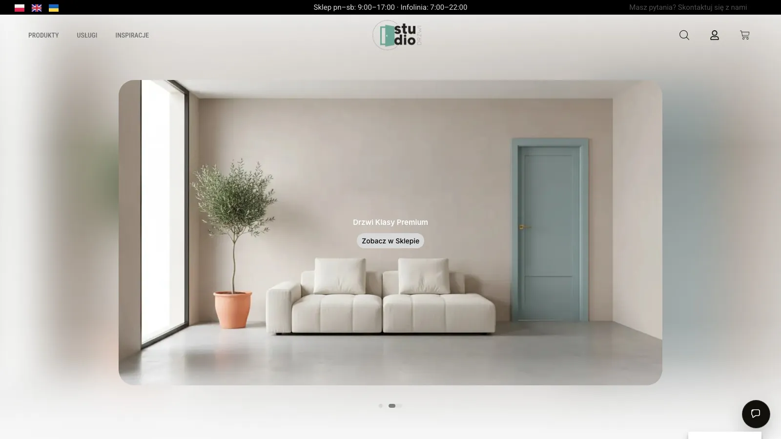
Studio Drzwi is a useful setting for this distinction. A room image can introduce the visual direction, while product details need their own space. A cinematic concept should remain identifiable as a concept; it should not imply that every finish or fitting shown belongs to a purchasable configuration.
Make a choice easy to revise
People rarely move through a catalogue in a straight line. They narrow a selection, compare alternatives and go back. A useful filter interface keeps the active choices visible, makes individual choices easy to remove, and offers a clear way to start again.
Search needs the same care. An empty result is a moment to help: preserve the query, explain that nothing matched, and offer a sensible next step. Silently discarding the search or resetting the page asks the visitor to repeat work.
Judge the journey by a real task
A visual review is only the beginning. I would ask someone to find a suitable product, explain why it fits, and return to an alternative. Where they hesitate tells us more than whether they like the colour palette.
The aim is a catalogue that helps a visitor understand the choices and take the next step with confidence. Any claim about conversion or sales still needs measurement; an attractive redesign alone is not evidence of either.